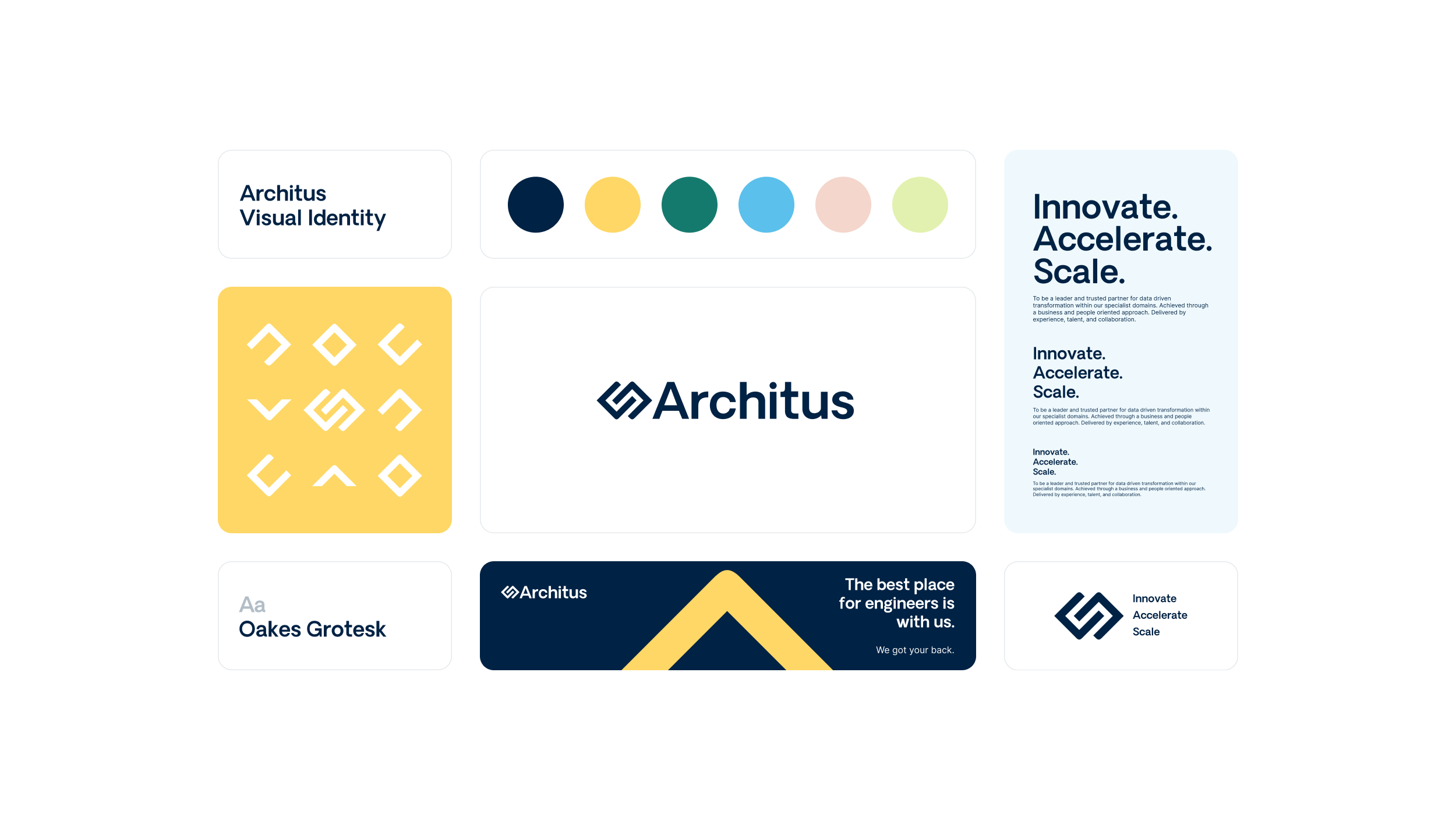
Future-forward branding for a growing European tech consultancy.
Project.
Visual Brand and Website Refresh
Client.
Architus
Year.
2023
The challenge.
Architus collaborated with Atlanttico to enhance and update their visual brand. Originally crafted by the company founders, the brand required a more robust, clearly defined, and versatile identity. Additionally, there was a need to improve the way the website and presentations represented the company's scale and dynamism to clients and staff, as they were not effectively conveying these aspects.
The solution.
Atlanttico undertook a thorough review of the Architus logo, starting with analysing the typography and progressing to redesigning and refining the symbol. This process was enriched by collaborative sessions with the Architus founders, where insights were gained into their preferences and critiques of the existing identity. These sessions also provided a deeper understanding of the target audience and the brand's positioning.
Following these discussions, a brand book was developed. This included a revised and expanded colour palette, a compact version of the logo, and guidelines for its application across various marketing materials.
Subsequently, the website, hosted on Wix, underwent a complete update to align with the new brand identity.
Brand experience.
Benchmarking
Visual identity
Brand book
Marketing collaterals
Product design & development.
UI design
Web development
Visual brand.
Oakes Grotesk was chosen for its professional appearance and the subtle curvature of its characters, particularly the 't' ascender. This same curve was incorporated into the symbol, creating a cohesive connection with the logotype. Additional visual elements were inspired by this curve, enhancing the overall design.
For body text, Inter emerged as the ideal secondary font family. Its optimisation for digital platforms and its harmonious compatibility with Oakes Grotesk made it a clear choice.
The symbol underwent a significant redesign, being redrawn from scratch. Its shape was simplified, its symmetry corrected, and the balance with the brand name was improved for a more cohesive appearance.
The colour palette, initially comprising various shades of dark blue, underwent a revision to include an accent colour, thereby broadening its versatility. A carefully selected range of colours, including blue, yellow, green, orange, and earth tones, were chosen. Each shade was tested to ensure similar luminosity, enabling them to work together harmoniously. Yellow, reminiscent of the sun, was chosen as the accent colour.
Marketing collateral.
Additional assets, including presentation templates and branded charts, were developed to support Architus' business development efforts. A LinkedIn header and avatar were also created to maintain a consistent and professional online presence.
Website update.
The website, hosted on the Wix platform, received a visual update to align with Architus's new visual identity. This update introduced new styles, infusing the site with a fresh, contemporary look that resonates with the brand's evolving aesthetic.
To ensure long-term consistency and ease of maintenance, the team developed a range of reusable sections and templates. These elements are designed to facilitate the creation of new pages while maintaining a uniform appearance across the website. The update wasn't just limited to the desktop version; the mobile version was also optimised.
Final note.
The new visual identity and website were successfully completed and launched in early December. This update quickly garnered positive feedback from both staff and clients, reflecting its immediate impact and appeal.
Check their new look at architus.co.uk


