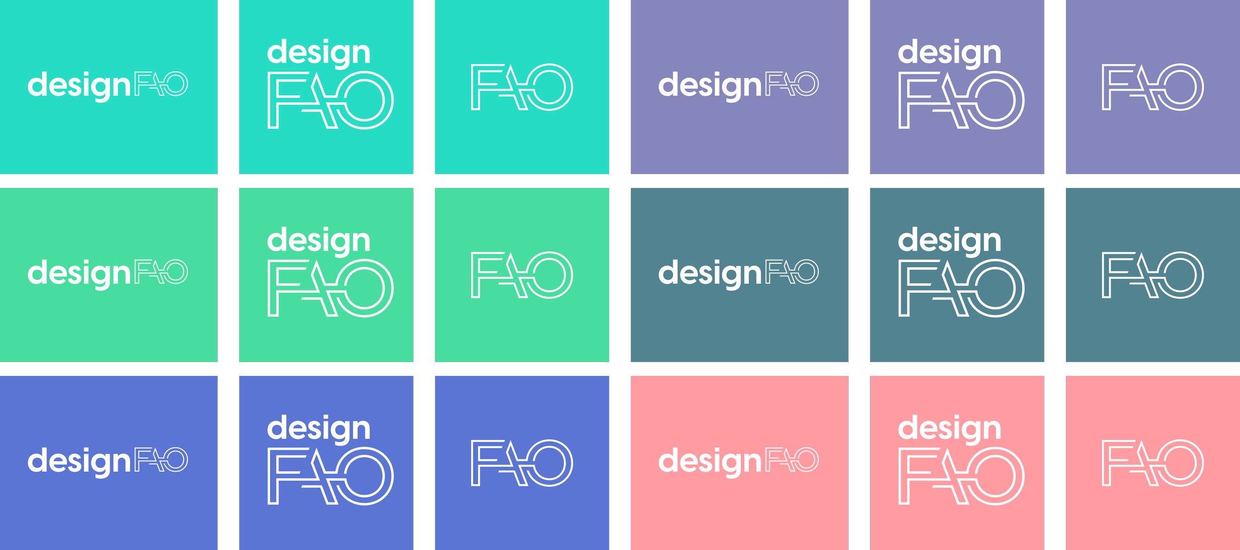


#designFAO Branding.
A versatile, playful and sophisticated visual identity.
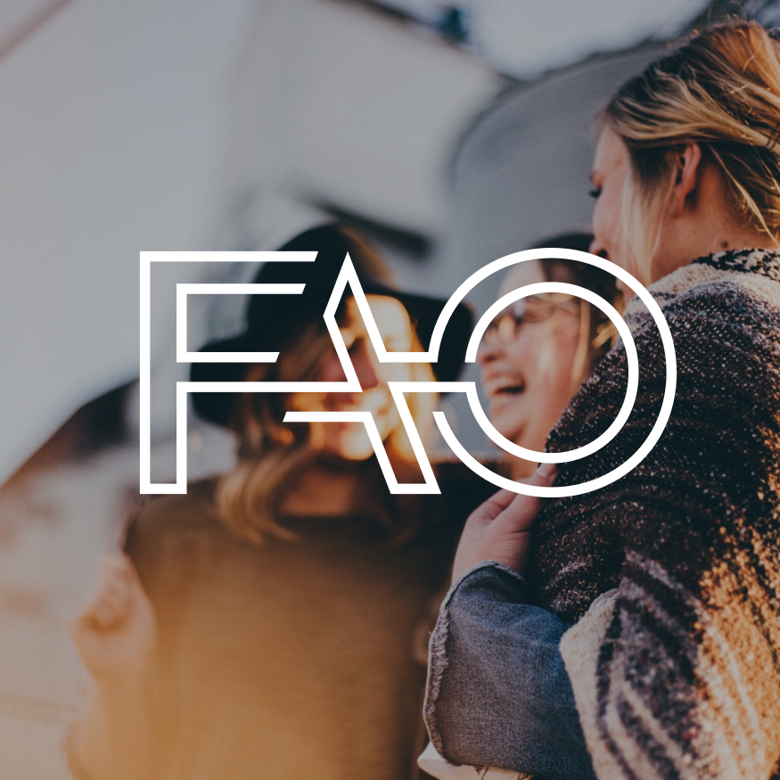
The logo is inspired by Faro's airport code, combining the location of the conference with the dynamism and creativity of the city on the Atlantic coast.
Intro.
#designFAO is a conference that brings together Creative People. It is a one-day event that provides inspiration, education, growth, and skills development through deep-dive talks.
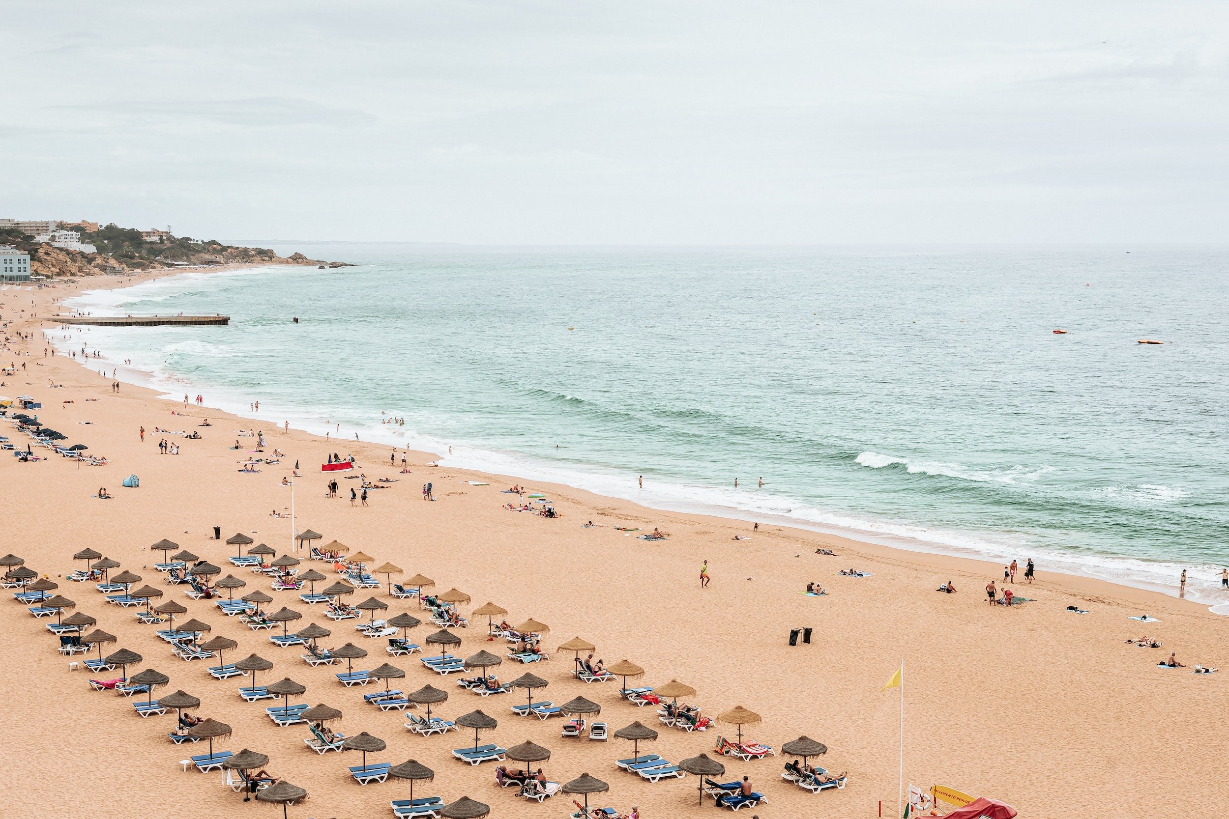
It takes place in Faro, a dynamic, affordable, charming and authentic Portuguese city.
Atlanttico was chosen to create the new conference visual identity to be applied across all digital channels and marketing materials.
The brief.
“I want to bring the spirit of the beach culture, food, sun, and good vibe Faro has to offer. The airport code is essential as it's been used for the conference name. Faro airport is what gets most people to the city, and I'd like it to be a symbol of connection.”
— Rui Barroca, Founder
Early brand explorations.


The chosen route.
We decided the primary focus should be on the airport code element, making it versatile enough to create visually compelling compositions and a solid base for different materials.
To reinforce the concept of connection, the two lines that build the logo, reminiscing the tyre marks planes create on the pavement, possess playful and sophisticated qualities.